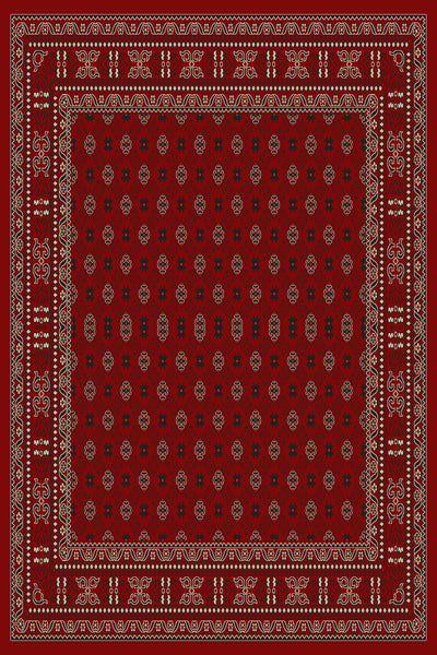
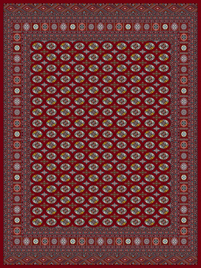
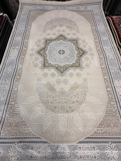
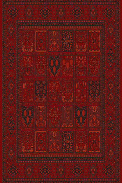
The short answer: Pick a rug color by working from the room you have, not the rug you want. The four anchors are: (1) floor color — the rug should contrast the floor enough to read as intentional; (2) sofa fabric — the rug should harmonize (share warmth or coolness) without matching exactly; (3) light direction — north-facing rooms need warm rugs, south-facing rooms can carry cool rugs; (4) pattern busy-ness — if your sofa is busy, the rug should be quieter and vice versa. The honest practical default for everyday rooms is a mid-tone traditional pattern with the dominant color drawn from your existing palette — it disappears into the room and lasts visually for decades.
Looking for the longer framework? Our working guide to palette, light, and pattern walks through the same anchors in more depth, with floor-specific and pattern-weight deep dives.
A field guide from our Sacramento showroom. We watch customers walk in with a color picked from Pinterest and walk out with something completely different — here’s why, and how to skip ahead to the right answer.
The four anchors
1. Floor color (the most-ignored anchor)
The rug sits on the floor. If the rug and floor are too close in color, the rug disappears — it just reads as a stained section of floor. Examples we see go wrong constantly:
- Honey hardwood + warm cream rug = visual mush.
- Grey LVP + grey rug = the rug is invisible.
- Dark walnut floor + dark navy rug = the rug looks like a hole in the room.
Better:
- Honey or red-oak floor — deep navy, indigo, or terracotta rug. Rich palettes pop against warm wood. See our red oak, white oak, and walnut pairing guide for a deeper breakdown.
- Grey or white-washed floor — warm Persian rug (rust, cream-and-red, antique gold). Adds warmth the floor doesn’t have. Our grey floor pairing guide covers LVP, grey-wash hardwood, and concrete specifically.
- Dark walnut or espresso — lighter rug with cream / ivory field. Brightens the room.
2. Sofa fabric (harmonize, don’t match)
The most common color mistake is matching the sofa to the rug. A grey sofa on a grey rug looks like a flat photograph. Instead, draw one color from the sofa fabric and let the rug carry that color plus complementary tones.
- Cream linen sofa — rug with cream in the medallion + rich field color (navy, rust, sage).
- Navy velvet sofa — rug with hints of navy in the border + warm field (terracotta, antique gold).
- Sage / muted-green sofa — rug with cream field and sage/rust accents. Browse our modern Persian rugs for examples.
- Black or charcoal sofa — the rug becomes the warmth source. Go rich: deep red, indigo, copper.
3. Light direction
Color reads completely differently depending on the light a room receives:
- North-facing rooms (cool, blue-grey daylight) — warm rugs (cream-and-rust, antique gold, terracotta) compensate. Cool rugs (grey, slate) read drab.
- South-facing rooms (warm, yellow daylight) — can carry cool rugs (indigo, slate, sage) comfortably. Warm rugs in south-facing rooms can feel oppressive.
- East-facing (warm morning, cool evening) — mid-tone palettes work well; avoid extremes.
- West-facing (cool morning, warm afternoon) — jewel-tone rugs (navy, ruby, emerald) read beautifully in afternoon light.
Take a sample home or photograph the room at two different times of day before committing.
4. Pattern busy-ness
The 80/20 rule: if your room’s upholstery is patterned or visually busy, the rug should be quieter (subtle medallion, abrash field, fewer colors). If your upholstery is solid, the rug can carry the visual energy (busy Persian medallion, tribal, multi-color). For a sanity check that resolves most close calls, see our patterned vs. solid rug guide.
Two busy things compete; one busy + one quiet is calm. Three busy things is chaos.
The honest practical default
If you don’t know where to start, this default works in 80% of rooms:
- Pattern — traditional medallion or tribal (Tabriz, Kashan, Heriz, Bidjar).
- Field color — deep but not black: navy, terracotta, indigo, deep cream.
- Border — contrasting but harmonized (cream border on navy field, navy border on cream field).
- Abrash — subtle color variation across the field reads luxurious.
This combination forgives spills, hides crumbs, harmonizes with most upholstery, and lasts visually for decades — the same reason these palettes have been Persian standards for centuries.
What to avoid in everyday rooms
- Solid cream / ivory / pale grey — every stain shows. Beautiful in catalog photos, miserable in real homes with pets, kids, or wine.
- Solid black / charcoal — every speck of lint shows. Dramatic for ten minutes, hard to live with.
- Trendy colors with short half-lives — millennial pink, sage green, terracotta-and-tan. Trends date fast; a Persian palette never does.
- High-contrast monochromes — black-and-white geometric patterns read busy and dated within five years.
Color by room
- Living room — the room’s primary palette. Default to mid-tone traditional patterns.
- Dining room — darker palette (navy, deep red, brown) hides food spills and crumbs.
- Bedroom — softer palette. Antique gold, cream-and-rust, faded indigo. Can be quieter than living room.
- Office / study — deep blues, oxblood reds. Persian medallion reads scholarly.
- Foyer / entryway — dark palette + busy pattern. Hides shoes-tracked-in dirt.
- Kitchen runner — traditional washable. Replace every 3–5 years.
Palettes that stay in style
Traditional palettes age well; trend colours date. A 9×12 navy-and-cream Tabriz-design rug bought today will still look deliberate in 30 years. A 9×12 mauve-and-tan abstract probably will not. These are machine-woven rugs, so this is about how long the room keeps looking right — not about resale; there is no second-hand market for power-loomed rugs. If you want the room to still look right in ten years, lean toward classical Persian-design palettes — navy, ruby, indigo, antique gold, terracotta, ivory, cream.
For deep-blue palettes specifically, see our blue Persian rugs collection — indigo and navy are among the most timeless field colors.
Read further in the palette / light / pattern series
- Working Guide to Palette, Light, and Pattern — the deeper 7-step framework.
- Rug color for oak floors — red oak, white oak, and walnut.
- Rug color for grey floors — LVP, grey-wash hardwood, and concrete.
- Patterned rug vs. solid rug — the room-weight rule for choosing.
When to come see us
If you’re color-shopping for a room, the most efficient single step is to bring a sofa fabric swatch, a wall paint chip, and a photo of the room (taken at the time of day you’re most often in it) to the showroom. We’ll lay options under those exact conditions and you’ll know within an hour.
— The Stylish Rugs Editorial Desk · Sacramento, CA · Updated 2023-11-30